

After being annoyed with Excel XP making rubbish charts for a report I did a bit of Googling for a better option. Juice Analytics has an excellent site that gives you the low down on making those default charts look better. I tried it out and it gets great results. However...
As well as a PC I also own a Macbook. On the Macbook I tried the free trial of Apple's iWork08 software, a cheaper version of Microsoft Office that is good enough for 90% of your Word, Excel and Powerpoint needs. Amongst other things iWork08 has great looking charts. Though I could have imported my Excel workbook into iWork08 I decided it would be much better to get Excel to replicate the Apple generated graphs. Based on the info from Juice Analytics and a bit of RTFM it turned out to be quite easy. These tips apply to Office XP version of Excel but I am sure the Vista charts will need some help too.
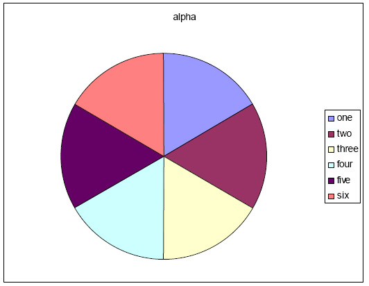
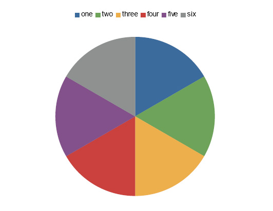
This how to will show you how to turn the default Excel charts:

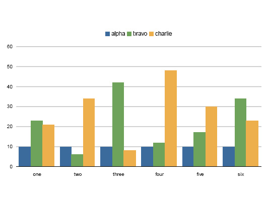
Into something a whole lot more Apple Cool:
Step 1: Change the Colours
The most basic change is to use some more modern colours than the default Excel ones. I chose to use the default colours that Apple uses as they are bright and have good contrast. I used to think that Excel had a limited colour palette and those were the only colours you can use. Turns out I was wrong.
Go to "Tools", "Options" on the menu and chose the "Color" tab. This opens the colour palette for the worksheet. Charts are drawn using the colours in the "Chart Fills" and "Chart Lines" starting from the left. You can modify these colours to a new set by clicking the "Modify..." button and then the "Custom" tab. I used the Apple colours that have the following RGB values:
1: 59,107,157If you need more than 6 colours then repeat from the top but lighten each up a bit by moving the slider on the colour chooser a little bit upwards. I also set one of the colours in the "Standard Colors" block to RGB 184,184,184 to use for grid lines.
2: 110,163,90
3: 237,175,76
4: 202,65,61
5: 131,81,139
6: 142, 145, 144
Step 2: Remove the Junk
For some bizarre reason, the default chart settings include a whole bunch of stuff that most of us don't want. So lets turn it all off.
Chart Area
Right click in any white space within the chart but outside of where the chart is drawn. Choose "Format Chart Area".
Patterns Tab
Set "Border" to "None"
If you are pasting into Powerpoint and want a transparent background set "Area" to "None"
Plot Area
This step does not apply to all chart types (e.g. Pie). Right click in the grey area behind the chart. Choose "Format Plot Area".
Patterns Tab
Set "Border" to "None"
Set "Area" to "None"
Grid Lines
This step does not apply to all chart types (e.g. Pie). Right click on the grid lines. Choose "Format Gridlines".
Patterns Tab
Set "Color" to the grey you set above to 184,184,184
Set "Weight" to the third weight down
Axis
This step does not apply to all chart types (e.g. Pie). Right click on one of the axes. Choose "Format Axis".
Patterns Tab
Set "Lines" to "None" - This should only be done on one of the 2 axes. Leave the line alone for the axis that bars are columns originate from.
Set "Major tick mark type" to "None"
Data Series
For each series in the chart (bar, column, pie segment, etc) right click. Choose "Format Data Series".
Patterns Tab
Set "Border" to "None"
Options Tab
For bar and column charts change the "Gap Width" to "50" to make the bars thicker.
Legend
Right click on the legend. Choose "Format Legend".
Patterns Tab
Set "Border" to "None"
Placement Tab
Set "Placement" to "Top"
That's it! Sit back and admire your much cooler, easier to read, more professional looking chart!
Step 3: Save it
Now you have gone to all that effort you can save your new format to apply to future graphs.
Right click on your new chart and select "Chart Type".
Select the "Custom Types" tab.
Near the bottom click "User-Defined".
Click the "Add" button that has just appeared.
Give it a name and description.
The next time you create a chart click to "Custom Types" and "User-defined" and you will see your cool format chart in the list. Unfortunately it does not store the "Chart Area" settings but those are easy to fix.
Colours are stored with the worksheet so creating a new Excel file will reset the colours. You can import colours from other open Excel files by selecting the file with your new colour theme in the "Copy colors from" drop down.
Have fun!


1 comment:
Thank you thank you thank you
Post a Comment